On a project at work, we recently decided to change a JS-library for graph-drawing to D3.js. The reason for this was because the project itself is very data-driven, so we wanted to be able to make new visualizations in the future. So it made sense to use a library that let’s you do this kind of stuff from scratch, like D3.
I’m the kind of guy that learns new things fastest with learning-by-doing, which might result in pretty hilarious outcomes. So this post is not a tutorial or anything, I just found some screenshots from my learning-phase and though it would be funny to share them!
Step 1 - Installation
Before I did anything I wanted to make sure that I could include the D3 library and launch an example. We were also trying a new MVC-library so it felt like a good idea to make sure things wouldn’t break.
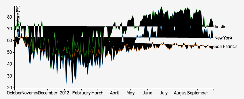
It went kinda okay I guess? It just looked a bit weird without the proper CSS.
Step 2 - Getting my data to work
The next step was to make sure that the data used in our old graph still worked in D3. Of course it would, but I had to learn exactly how I was going to use it. And well, it’s kinda tricky when you’re not too sure about what you’re doing:
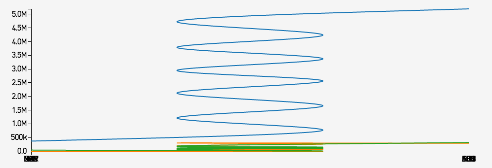
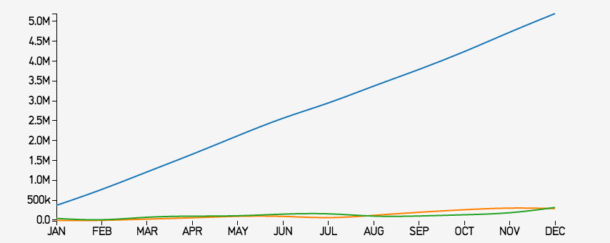
Wow, didn’t expect that! I think what I was trying to do here was getting the x-axis to show the names of the months, but they weren’t stored as Date-objects so I couldn’t use a time-scale. At some point, I accidentally made the graph look like this. After a while, I managed to get it working by using a simple linear scale, and map the indexes to the name of the month. Kinda feels like I’m cheating, but I think it’s the smoothest way unless I want to convert everything to Date-objects.
Step 3 - Let’s add some styling
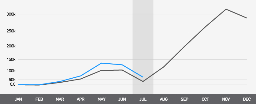
Now comes the boring part where everything is actually working as it should. I added my CSS and made the graph a bit more interactive, as you can see below. You can click on each month to get detailed information (shown under the graph on the webapp). I also played around with different scales on the y-axis, to see if I could make it easier to see smaller changes in the graph. We will probably end up with a regular click-to-zoom though.
Step 4 - Vacation
After finishing the CSS on the work-project, I went on vacation for a few weeks. And what do a programmer do on his vacation? Programming of course! I started working on a new hobby project to learn a bit more about NodeJS (and more), and during this I figured: Why not use my new D3-knowledge as well?
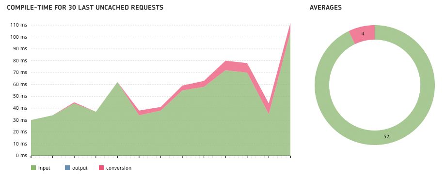
So first up we have a graph and a donut chart which shows us how fast uncached pages are built. The “conversion” area is pretty small, so I added the click-to-zoom-feature here too:
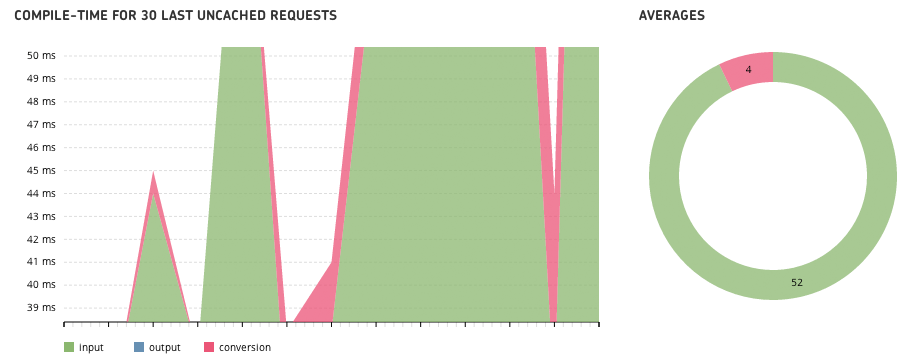
It zooms in where you click of course, and it’s animated so it looks pretty rad! I also made a simple bar chart for errors reported by my Node-app, showing how many errors occurred each day. Pretty good when you get bug reports about an error but can’t recreate it yourself, then you can see if the problem only happened during a certain day.

That’s all folks!
In the end, I definitely feel like D3 was the right choice for our project. It may take a while before you understand what’s going on, but when you finally get it you’ll have complete control over how your data is presented. D3 also has a huge gallery with examples, so it’s pretty easy to find out how where to begin if you want to build a new kind of chart.